How a tucked-away restaurant turned visitors into orders
Tlacuaches 808
Visitors were interested but never finished — every extra tap quietly lost the order. We built a one-page path from 'I want it' to 'paid,' with nothing in the way. Getting traffic but no calls or orders? It's the same problem, whether you sell tacos or appointments.
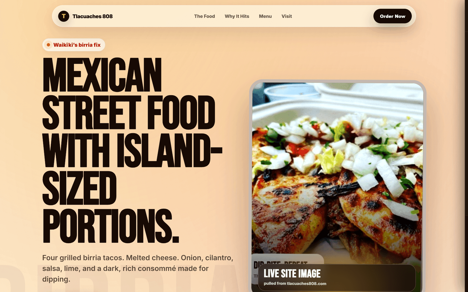
Tlacuaches 808 had a common restaurant problem: people could be interested in the food but still not make it to the order.
Most restaurant sites overwhelm with too many choices, too many clicks, too much friction. And this one is tucked inside Eaton Square — easy to miss if you don't already know where you're going.
So a hungry customer is left asking: what do they serve, what should I order, where exactly is it, are they open, how do I order, how long will it take?
Every unanswered question is a chance for the customer to leave.
We designed the page around one goal: keep the customer moving toward the order.
It guides someone from interest to action without making them think — explain the food simply, confirm the craving with strong photography, solve the location problem, and keep the menu and ordering on the same page so they never have to jump around.
The strategy wasn't to show everything. It was to remove friction.
The strategy wasn't to show everything. It was to remove friction.
A one-page ordering experience that takes the customer from craving to checkout without leaving the page.
A clear food promise
“Mexican street food with island-sized portions.”
Hero on the signature dish
Birria tacos with consommé for dipping — an instant reason to care.
Menu built into the page
Items, prices, and add-to-cart, no jumping around.
Checkout with a pickup window
A 20–25 min estimate that cuts “is it ready yet?” calls.
Tucked inside Eaton Square at 438 Hobron Lane, Unit 115. Alongside the address, hours, and an open-map link, the page walks customers to the counter:
- 1Start at the Eaton Square entrance
- 2Follow the courtyard walkway
- 3Arrive at the counter
A restaurant website has one job: turn hunger into action.
If the customer has to search, think, call, or guess too much, the order is at risk. This build removes those small points of friction — helping them understand the food, find the restaurant, and order quickly.
It also saves the owner from answering the same questions about menu, location, hours, and pickup timing all day.
A restaurant website has one job: turn hunger into action.
The page is the first step in a cleaner ordering system that can expand into:
- —Live online ordering with kitchen notifications
- —Pickup estimates and menu updates
- —Daily specials and delivery options
- —Customer text updates and repeat-customer offers
- —QR codes from nearby hotels
- —Google Business and social traffic paths
People shouldn't have to work hard to order good food. They should see it, crave it, find it, order it.
Want this kind of path for your business?
Start the Clarity PathSee what your business is missing.
Or book a 15-minute call